Starting on March 11, 3D Secure 2.0 will be introduced for credit card payments. See details here.
How to Keep a Color Journal — and See the World Differently
Innovation
Clear your mind, connect with your surroundings, and hone your creative muscle with this simple daily practice. Four Nike designers show you how.
This is a modal window.
“Hands On” is a series where you’ll learn tactile techniques from expert innovators.
“They say that color is a whole other language,” says Jaana Beidler. “It’s one without any words, that connects intuitively and deeply with us. It carries a lot of emotions.”
Color is a language that Jaana, as a senior director of color design at Nike, is fluent in — and one she wanted to keep speaking with her tight-knit team when they started working remotely due to the pandemic. Having read that journaling often helps people process difficult times and moments of crisis, Jaana had an idea to do the same…except with her own twist.
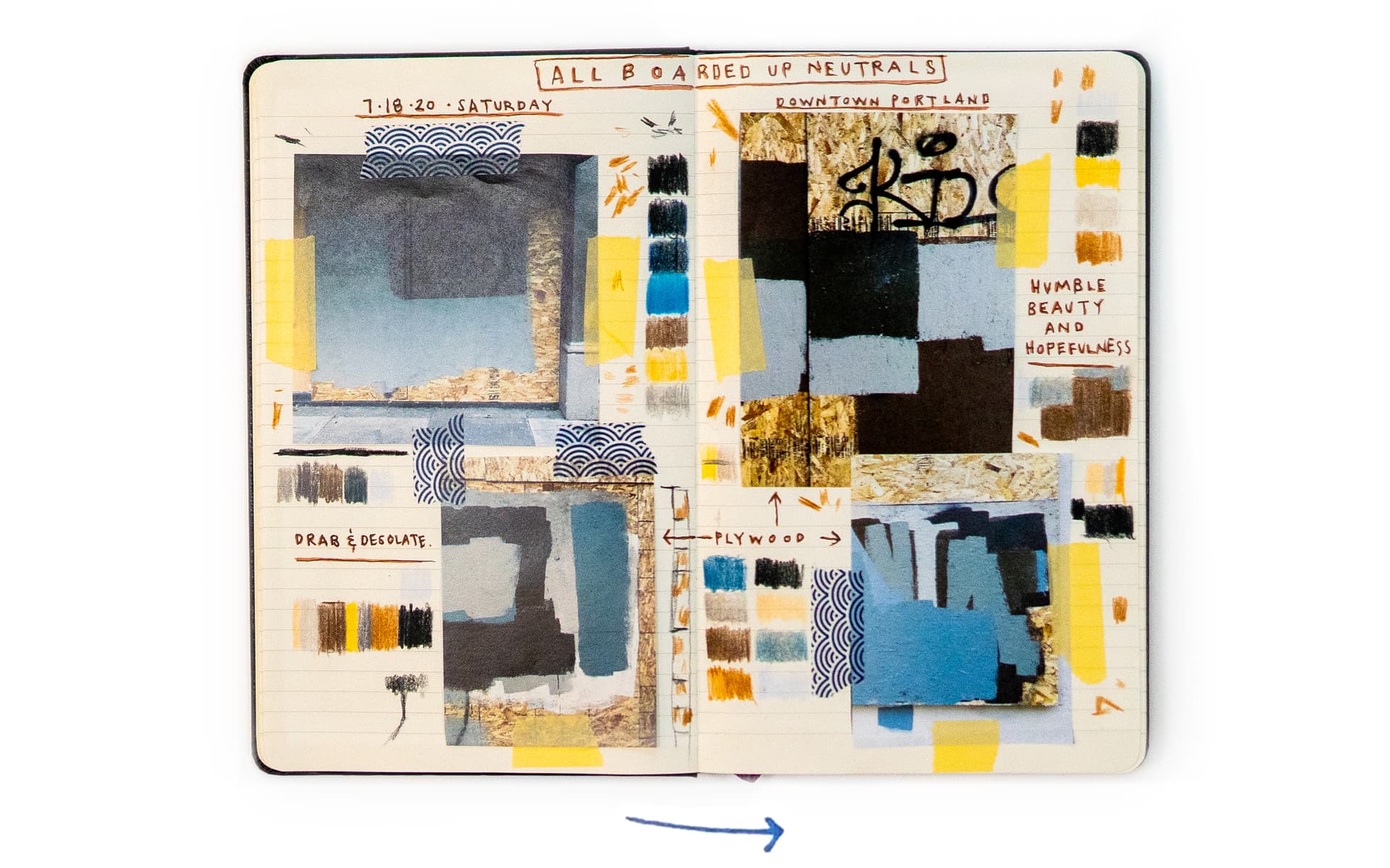
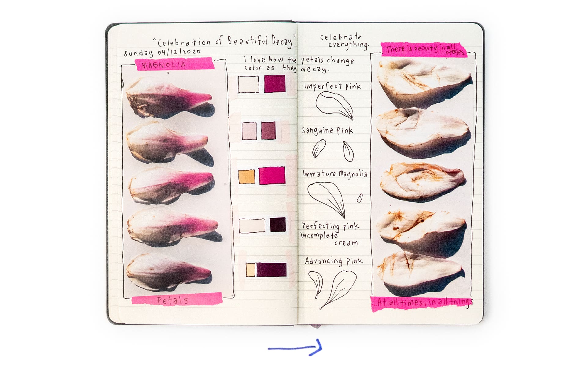
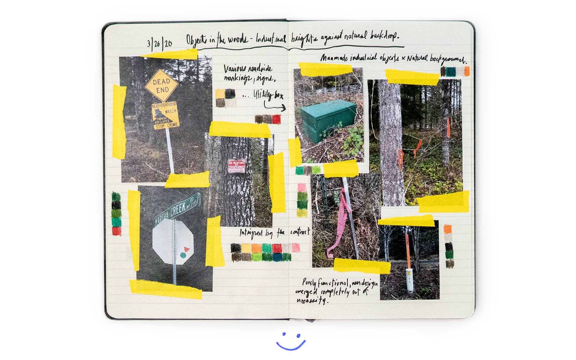
“Words, at least from me, don’t come easy. I think in colors,” says Jaana. “So instead of writing a journal, [keeping a] color journal seemed like something that would be more impactful for us.” And so, Jaana invited members of her team to start documenting visuals that struck them in their day-to-day lives. At home and around their neighborhoods, they began to see subtle beauty in everyday details: high-vis road signs standing out in a natural setting, a vibrant pink flower decaying over days, the bright blues and greens of tennis courts and soccer fields sitting empty and unused — and so much more.
Watch the video above to learn color journaling methods from Jaana and other Nike designers, and hear about the mental and emotional benefits this creative practice can offer. Below, find a step-by-step guide, sample entries from the group, and a template to help you start a color journal of your own.

A Step-By-Step Guide to Color Journaling
Step 1: Observe
Start by simply looking around you with curiosity and intent. “Noticing shapes, textures, colors and how they interact with each other…[is] almost like a meditative practice,” says Nicola Trigg, a senior design director at Nike and fellow color journaler.
So go for a walk, take your time, and don’t get too caught up in finding something epic. It’s all about clearing your mind, seeing details, and taking in your surroundings and feelings. “[It] can be something as tiny as a leaf on the floor, or the giant clouds in the sky — or the fact that everyone has weird mailboxes,” muses Nicola.
Step 2: Capture
Next, document your findings. “We all take so many pictures, so definitely you can use your phone camera, but it’s also fun to try to do it very analog,” says Jaana. “You can pick up something you find on your way and put it in a journal and really look at it. Let it be real and tangible.”
Other ideas? Take a sketchbook, draw what you see and paint the colors on the pages, suggests Chiyo Takahashi, another senior design director at Nike. “I don’t think there’s a right or wrong way,” she says.
This is a modal window.
At the time of filming, Jaana, Chiyo, Courtney and Nicola were members of Nike’s Color Design team, which is responsible for observing the world and translating societal trends into seasonal color palettes for Nike footwear, apparel and equipment. Some have since moved on to other roles at Nike, but color theory will no doubt remain a lifelong passion.
Step 3: Identify
Once you have your image or objects, build a palette by selecting individual colors that catch your attention. You can use traditional tools like markers, paints, colored pencils — or go digital on your computer or phone, using an app with a color dropper tool.
The magic is what your eyes and cursor are drawn to, says Chiyo. “Depending on where you click, the colors are so different, so you do have to use your intuition and what feels right to you that summarizes what you’re seeing. It’s definitely a process of editing that’s involved.”
“For me, it’s almost like analyzing and challenging my own ideas,” adds Jaana. “I have noticed over the years that I gravitate toward certain things. I’m trying to get out of my own comfort zone. I’m pulling colors that are not the typical ones that I usually go to.”
Next, name your colors, based on your own experience and reflections. It’s also where the fun comes in for Courtney Dailey, a product design VP at Nike. “[It’s] a way to be a bit cheeky sometimes,” she says. Some examples from the group? Closed Down Brown, Rotting Rainbow Chard and Plastic Flamingo Pink — just to name a few.
Step 4: Reflect
Lastly, let your thoughts come out. What do the colors remind you of? How do they make you feel? What was on your mind at the time? As Jaana and the others have learned, this step is where a lot of growth and centering can happen.
“I think that adds another level of introspection,” says Chiyo, who was struck by the stark beige color of empty shelves in grocery stores at the start of the pandemic. “Journaling just really helps [me] process how I’m feeling at this moment. It increases your awareness of the world, [and your ability to be] more curious and open.”
Get Inspiration From the Entries Below...
...And Create Your Own Color Journal
The team’s biggest takeaway? Let your journal be yours. Whatever catches your eye, however you want to document it, any thoughts or emotions that come to mind as you reflect — it’s yours to create.
Use journaling as an opportunity to de-stress and tap into your creative and observational mind. The fact that it’s separate from work or deadlines is what makes color journaling so special and important to Courtney. “It’s just creativity for creativity’s sake,” she says.
Here’s a template to get you started — or you can make your own. There’s no wrong way to keep a color journal.
This is a modal window.
(Note: PDF available in English only.)
Film: Azsa West
Words: Brinkley Fox
Reported: November 2020


