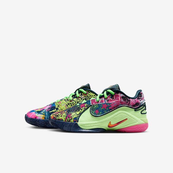
A’ja Wilson’s Nike Logo Defies Expectations
Product News
The basketball star’s mark is more than a logo — it’s a statement of presence, power and personality.
A’ja Wilson has never fit into a mold. Her dominance on the court and unshakable confidence off it make her presence undeniable. That essence now lives in her signature Nike logo — a gleaming emblem that encapsulates her multifaceted personality, career and impact. But, like all powerful expressions of identity, it wasn’t made to be easily understood. It was made to be felt.
“When athletes wear my shoe or any of the pieces from my collection, I want them to feel the power behind that logo: the power to dream big, then put in the work — in style and confidence,” A’ja says.
The journey to creating the design of A’ja Wilson’s logo was just as unconventional as she is. The deeply intricate process and expectation-defying approach made it a true extension of one of basketball’s most dynamic forces.
A Logo That Sparks Conversation
When Nike expert footwear and apparel designer Josanna Torrocha set out to create A’ja’s mark, she knew it had to be as distinct and captivating as the athlete herself. Dynamic, vibrant and unconventional. Capturing A’ja meant going beyond the traditional sports logo formula — symmetrical and streamlined — by creating something that pulsed with her energy.
At the outset, there was a lot on the cutting room floor — approaches that were more straightforward and not unique enough to A’ja. So Torrocha worked at it, sketch after sketch, turning her initial idea into something more closely resembling an “A.” A’ja’s signature sparkle ultimately became central to the design, a reflection of the energy she carries and the way she lights up a room.
Torrocha studied A’ja’s movement, energy and presence, pulling from the basketball star’s own handwriting to form a nod to her first initial, “A” — a personal signature that made the mark unmistakably hers. The sparkle shape honored A’ja’s “diamond in the rough” nickname, her commanding presence, and her affinity for bold, feminine details like glitter and pearls. Even the asymmetry of the design broke convention, reflecting A’ja’s ability to command attention in her own way.
The final element was a subtle but powerful “1” embedded within the design — symbolizing A’ja’s Nike A’One collection and status at the top of her game.
“If you don’t know how I shine … now you will. Period.”
A'ja Wilson
Polarizing but Powerful
The reaction to A’ja’s logo was immediate — and divided. Some loved its boldness and originality. Others struggled to make sense of it.
“There was a very polarizing reaction,” Torrocha shares. “That’s the most a designer could ever want because you always want somebody to feel something about your work. If they’re indifferent, that means you didn’t do your job.”
A’ja, however, never wavered. Unlike anything in Nike’s portfolio, it felt true to her — unexpected but still grounded in the elements she values. Its instant recognizability is emblematic of how she designed the A’One shoe.
More Than a Logo — A Movement
The A’ja Wilson logo isn’t just a mark stamped onto the A’One Collection. It’s a statement, a symbol of pushing boundaries. A’ja’s entire career has been about rewriting expectations, and her logo is an extension of that. It doesn’t fit into the mold of what a sports logo is “supposed” to be — because neither does she.
“It made people talk — whether they loved it or hated it, they were still talking about it,” Torrocha says of her design. “That means it’s living within you, it’s in your mind, you’re evaluating it in some way. It pushes you outside of your comfort zone and allows you to open up to something unconventional.”
Wearing the A’ja Wilson logo isn’t just a choice. It’s a declaration. You’re backing something unapologetic, something unstoppable, something that doesn’t conform — it dominates. It doesn’t ask for recognition — it demands it. Because standing out isn’t a risk. It’s the only way to be legendary. Just like A’ja.
Shop Nike Basketball Shoes


Related Stories
Product News
Nike Vaporfly 4 and Nike Streakfly 2: A Look at the Innovation Behind the Brand’s Latest Racing...
Product News
Nike Air Max Day 2025: Introducing the Air Max Dn8

Buying Guide
The Best Running Shoes for Treadmill
Buying Guide
The Best Nike Sneakers for Work
Activity
How Often Should I Replace My Running Shoes?